What Is Your t-SNE or UMAP Plot Telling You? A Survey of Methods to Explain 2D Embeddings
In short
Scientists in many fields, from single-cell biology to the social sciences, routinely map high-dimensional data into a two-dimensional scatterplot with methods such as PCA, t-SNE or UMAP. These plots are very good at showing that there is structure: groups of cells, gradual trajectories, outliers. They do not tell you what these structures mean. The axes of a t-SNE or UMAP plot have no meaning, and a visible cluster does not come with a label saying which feature values put it there.
A growing family of methods tries to close that gap by linking the patterns in a 2D embedding back to the original features. Which genes separate these two clusters? Which variables change along this trajectory? What would a data point need to look like to land in that empty region? The field is moving quickly, but methods use different terminology, assumptions and evaluations, which makes it hard to navigate.
In our new survey, “The State-of-the-Art in Explanation Methods for Two-Dimensional Embeddings”, we review 40 explanation methods from machine learning, visualization and the applied sciences, and organize them in a taxonomy that asks: what do you want to explain (a point, a trajectory, a cluster, or the whole layout), what question are you asking, which dimensionality reduction methods and data types are supported, what the explanation looks like, and how it was evaluated.
For practitioners, the survey works as a selection guide, complemented by an interactive survey browser to filter methods by your data and goals. For method developers, it highlights open problems: explanations rarely account for distortions in the embedding itself, and there are no shared benchmarks to compare methods against each other.
How do you interpret an embedding without axis labels?
Imagine you have measured 30 surface markers on a million immune cells, or 20,000 genes on a few thousand tissue samples, or you have computed text embeddings for every abstract in a literature database. Nobody can look at a table like that directly. Dimensionality reduction (DR) offers a way out: it places every data point in a 2D plane so that points that are similar in the original data end up close together. Principal Component Analysis (PCA) has been used for this for more than half a century; over the past 10 years, non-linear methods such as t-SNE and UMAP have made it a standard step in fields like single-cell genomics.
No 2D picture can preserve everything about high-dimensional data. Each DR method makes its own trade-off about what to keep (local neighbourhoods, global distances, topology) and what to sacrifice. In an ordinary scatterplot the x- and y-axes tell you exactly what you are looking at; in a t-SNE or UMAP plot the axes do not correspond to any original feature at all. The layout emerges from a complex, non-linear combination of all features.
So analysts are left asking questions such as:
- Why do these points form a cluster?
- What distinguishes cluster A from cluster B?
- Which variables change as I move along this elongated “arm” of the embedding?
- How would this sample need to change to end up over there?
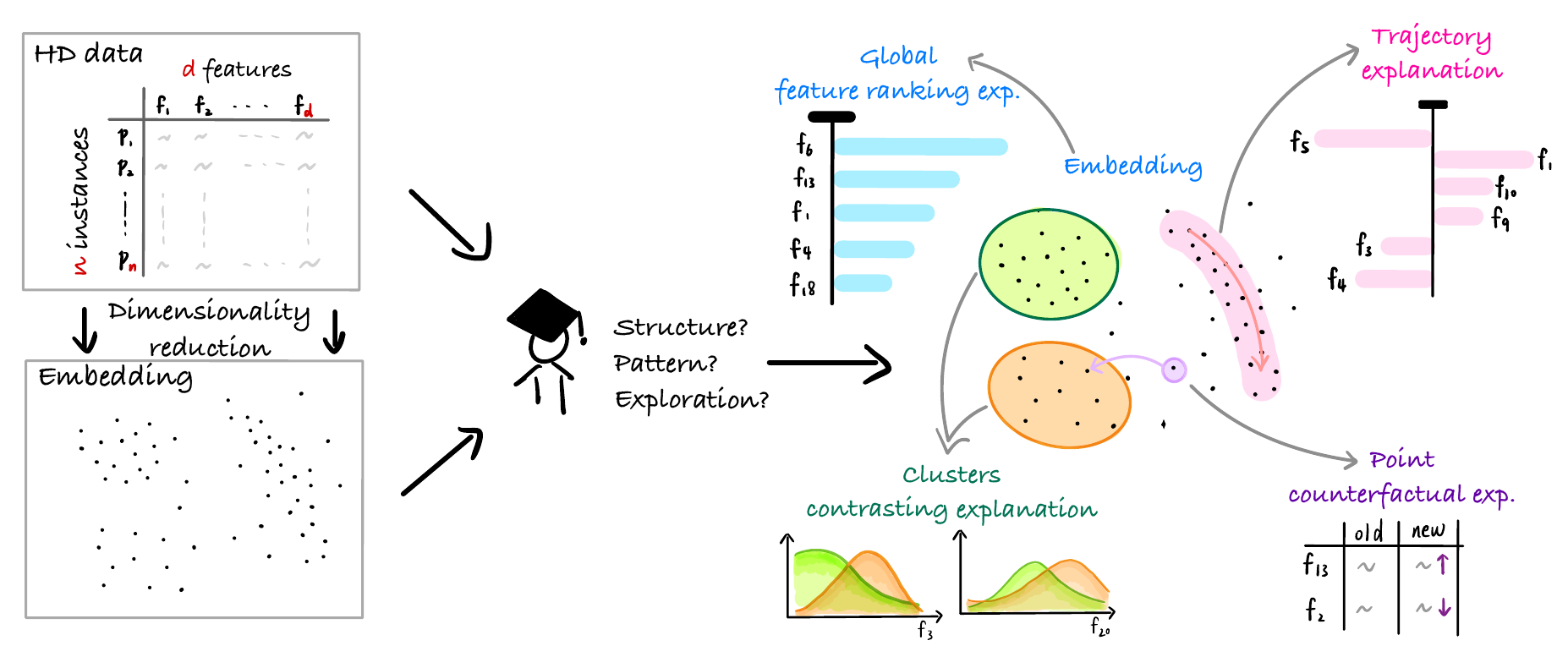
Answering such questions by hand, by colouring the plot by one variable at a time, quickly becomes impractical when there are dozens or thousands of variables. Explanation methods for dimensionality reduction (DRX methods for short) do that work for you. They compute a link between the structure you see in 2D and the features in your original data (as illustrated in the figure at the top of this post).
A taxonomy of 40 explanation methods
We systematically searched the literature (DBLP and Scopus), using a large language model as a first-pass screening aid followed by independent review by two of the authors, and arrived at 42 papers describing 40 distinct methods. We restricted ourselves to post-hoc methods: you first compute your embedding as usual, with your preferred DR method, and then explain it.
We then built a taxonomy that describes every method along a number of aspects:
- Explanation target: a single point, a trajectory or direction, a cluster, or the global structure.
- Analysis task: what kind of question you are asking (see below).
- Compatibility: which DR methods and which data types (numeric, categorical, text, images, specific domains like gene expression) the method supports.
- Output form: what the explanation is, e.g., a ranking of features, arrows, rules or a decision tree, a counterfactual, or even a sentence in natural language.
- Visualization and interaction: how the explanation is shown, and whether you can interact with it.
- Evaluation: how the authors checked that the explanation is any good.
DRX methods support three analysis tasks
A central insight of the survey is that, although the methods look very different, they support essentially three analysis tasks:
- Characterize a structure. Why does this pattern look the way it does? For example: “Which features are similar among the points in this cluster, explaining why they group together?” This is the most common task, supported by 22 of the 40 methods.
- Discriminate a structure. What distinguishes this pattern from something else? That “something else” can be another cluster you pick, all remaining points, or the dataset as a whole. For example: “Cluster A has higher values on feature X and lower values on feature Y than cluster B.” Twelve methods do this.
- Probe the DR mapping. Ask what if or how to: “If I increase feature X for this point, where would it move?” or “What would a data point at this empty location in the plot look like?” Eight methods support this.
Combining these tasks with the four targets gives a map of the questions you can ask about an embedding, and which methods answer each one:
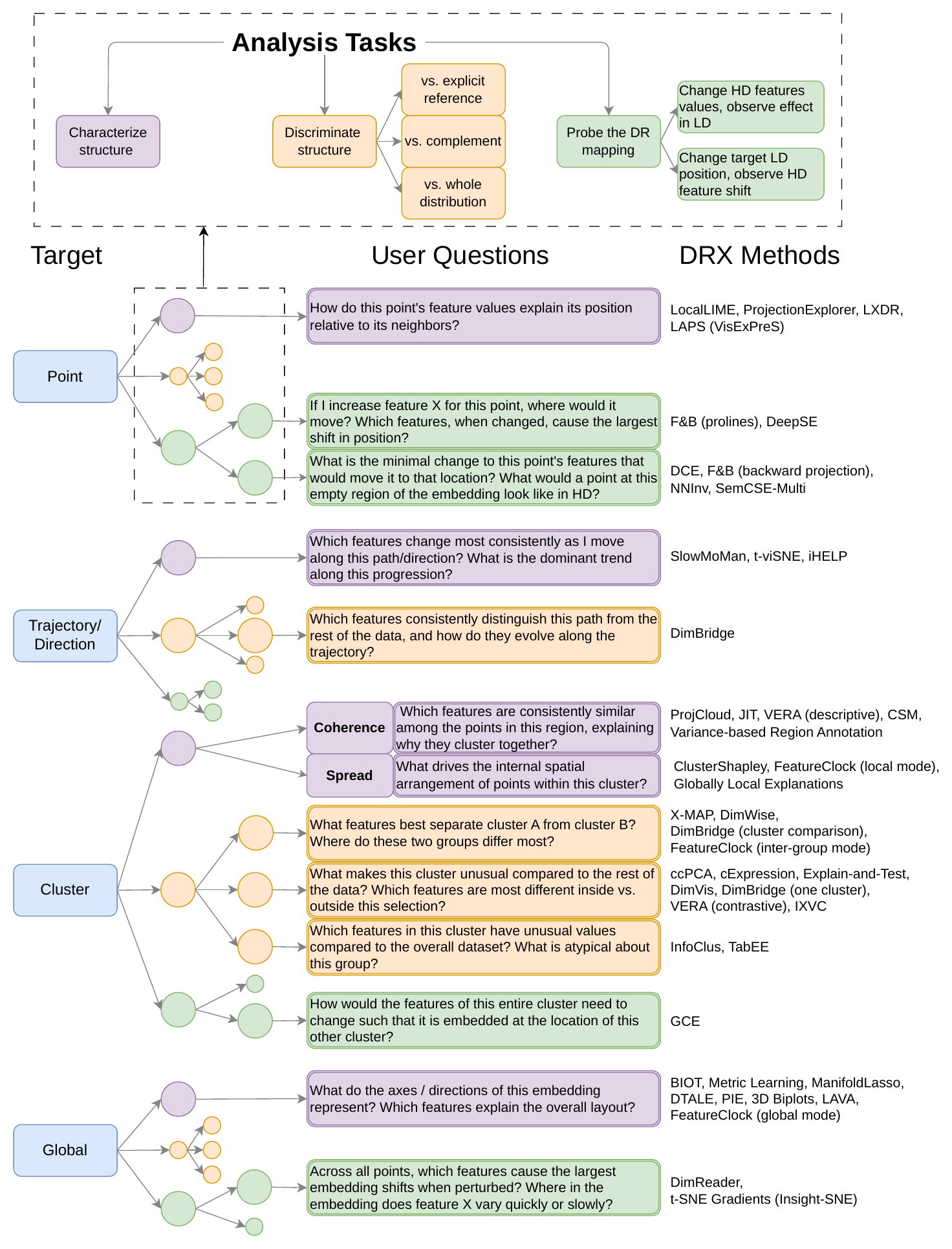
The questions you can ask about an embedding, organized by explanation target (left) and analysis task (colour), with the methods that address each combination (right).
Clusters are by far the most popular target (19 of 40 methods) and the only one for which all three tasks are covered. That is no surprise: high-dimensional data often contains groups, methods like t-SNE tend to emphasize them, and they are easy to select. Trajectories, which are crucial in, e.g., studying cell differentiation or disease progression, are much less well served, and no method yet probes how a trajectory would change if the underlying data changed.
What is the explanation output?
The most common output, used by 28 of the 40 methods, is a feature importance ranking: a list of the variables that matter most for the pattern you selected. Under the hood, methods compute these rankings in very different ways. Some train a simple, interpretable “surrogate” model, such as a (sparse) linear regression, that mimics the embedding locally or per cluster. Others use statistical tests, correlations, variances, or information-theoretic measures that compare a feature’s distribution inside a cluster with its distribution outside.
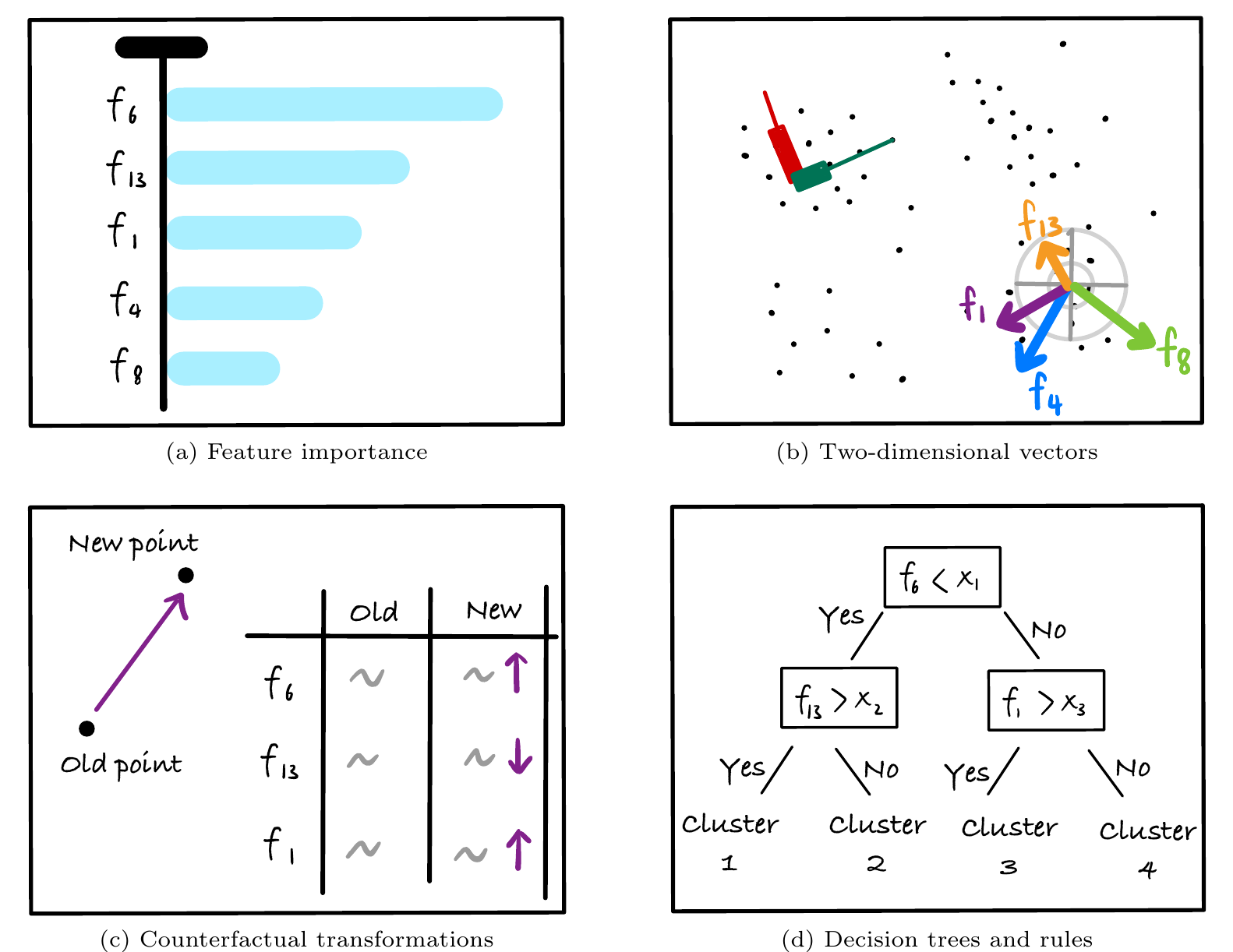
Common explanation outputs: (a) a ranking of feature importance, (b) feature directions drawn as arrows or axes in the embedding, (c) a counterfactual showing how a point's features must change to move it to a new location, and (d) a decision tree that describes clusters with simple rules.
Other methods draw geometric structure directly in the 2D plane, such as arrows indicating in which direction a feature increases, or curves showing how a point would move if one feature were changed. Rules and decision trees describe a cluster with readable statements like “feature 6 below this value and feature 13 above that value”. Counterfactual methods tell you how a point would need to change to land somewhere else. And a few recent methods produce natural language descriptions, for example by asking a large language model to summarize the documents in a cluster of a text embedding.
A recurring design concern is complexity control. An explanation listing a thousand genes is not much of an explanation. Methods keep things digestible by showing only the top-k features, by building sparsity into the optimization, or by aggregating related features into groups.
Visualizing the explanation
How an explanation is shown matters as much as how it is computed. About half of the methods use layout enrichment: they draw the explanation directly onto the embedding. This can be done in three ways: by adding elements such as arrows or labels on top of the points, by annotating each cluster separately, or by first dividing the plane into regions (a grid, or contour lines) and colouring those.
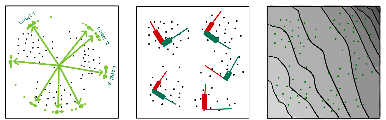
Three ways to enrich an embedding with an explanation: arrows drawn directly on the layout (left), explanations attached to each cluster (middle), and contour lines that act as a kind of curved axis for one feature (right).
The other half either have no specific visualization format or show the explanation in separate charts next to the plot: bar charts and heatmaps of feature importance, histograms comparing a cluster to the rest of the data, or more elaborate coordinated views. About half of the methods come with an interactive tool, where you can lasso a cluster, draw a trajectory, or drag a point to a new location and see how its features would have to change.
How do we know an explanation is right?
This is where the field is least mature. Every method is demonstrated with case studies, and some are convincingly validated against domain knowledge, for instance by checking that the genes or markers they highlight match those that experts use to annotate cell types. But there is no consensus on what to measure quantitatively. Only 16 methods report a quantitative evaluation without humans in the loop (for example, how accurately a surrogate model reproduces the embedding), and these use a variety of measures. Only six report a user study, and few compare competing methods with each other on the same data and the same question.
Practical advice if you work with embeddings
We believe it is too early to give a definitive “use method X” recommendation, but the survey does offer a practical route:
- Start from your question. Decide what you want to explain (a point, a trajectory, a cluster, or the overall layout) and which kind of question you have (characterize, discriminate, or probe). The tasks-and-targets figure above gives you a shortlist.
- Filter by your setting. Use the survey browser to narrow the shortlist by data type and DR method. Many methods work with any embedding, but some require, e.g., t-SNE specifically, a differentiable or parametric DR method, or the ability to embed new points.
- Check availability. Only about half of the surveyed methods have a public implementation.
- Remember that the explanation is only as good as the embedding. If the DR method has placed unrelated points together or torn a real group apart, an explanation can faithfully describe an artefact. It is worth checking embedding quality (e.g., with neighbourhood-preservation measures such as trustworthiness and continuity) in the regions you are explaining.
- Match the explanation to the DR method. Methods that relate features to global directions in the plot assume the global layout is meaningful. That is reasonable for PCA or MDS, but less so for t-SNE and UMAP where the relative placement of clusters can be largely arbitrary.
Open problems
For researchers developing new methods, our survey points to several gaps. Explanations and their visualizations should take into account embedding quality, for example by warning when a selected cluster sits in a poorly preserved region. Trajectories and other continuous structures deserve more attention. And most pressingly, the field needs shared benchmarks and user studies that compare methods on the same datasets, tasks and criteria. Without these it is hard for anyone, developer or end user, to know which method to trust for which job.
Read more
- The full survey: The State-of-the-Art in Explanation Methods for Two-Dimensional Embeddings by Edith Heiter, Fuyin Lai, Cyril de Bodt, Yvan Saeys and Jefrey Lijffijt. Preprint on Zenodo (with DOI), or through the Ghent University Library
- The interactive survey browser: aida-ugent.github.io/drx-survey-browser
The research leading to these results was funded/co-funded by the European Union (ERC, VIGILIA, 101142229), the Special Research Fund (BOF) of Ghent University (BOF20/IBF/117), the Flemish Government under the “Onderzoeksprogramma Artificiële Intelligentie (AI) Vlaanderen” programme, and the FWO (project number: G073924N). EH is supported by a doctoral scholarship from the FWO (project number: 11J2322N).
Follow us for more updates!